- Write With AI in Your Brand’s Voice with GrowthBar - April 21, 2023
- How Long Should a Blog Post Be? [2025] - April 14, 2023
- 13+ Best ChatGPT Prompts for SEOs [2025] - April 14, 2023
Ended soon
Have you tried driving a car without a steering wheel? Or opened a door without a handle? It’s very hard.
That’s because every product and item we use is trying to provide the best user experience (UX) and user interface (UI). The shoes we wear, the cameras we use, the laptop I’m using to write this post — every good product is focused on the experience customers have when using it.
That’s because customers with a good experience are more likely to purchase, repeat purchase and tell friends about their experience.
The story is no different when it comes to websites. UX and UI matter a lot. Think about clunky, old looking sites. Would you want to go to the James Bond Museum with a website like this?

Now think about sites you’ve seen with stellar UX/UI. They’re pretty, fast, delightfully intuitive, easy to navigate, and don’t often glitch or make you scratch your head.

UI and UX are also important for SEO — and even more now than ever before.
Google is continuously updating its algorithm to better align its search engine page results with what its searchers are looking for. In today’s world, searchers want an intuitive, simple, seamless experience on mobile and desktop. So of course, Google ranks sites in part according to site UI/UX.
In fact, the Page Experience Update in 2022 was purely about UI/UX. Google explicitly said when this update came out that elements of a site like HTTPS compatibility, load time, and “first contentful paint” (a speed metric) are important for ranking.
Table of Contents
User Experience & User Interface: Why are they important?
Without a good user experience, you won’t want to use a site, no matter how great the information or products they offer. And a good user experience needs a good user interface—otherwise there’s nothing to experience.
For example, Fidelity’s investment phone application recently released a new version.
This is their older version. Lots of information in small font, a small CTA (trade), lots of acronyms, etc.


And this is their newer version. Notice the difference? A big “Buy” button at the bottom, logo included, limited information listed, and a company profile right at the top of the page.
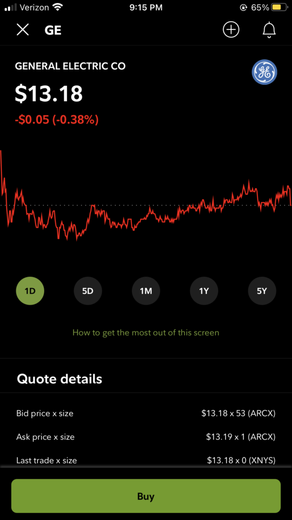
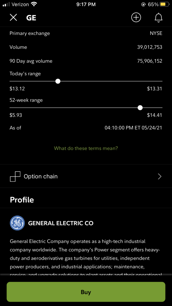
They even go one further by adding a link explaining the UX/UI of the page: “How to get the most out of this screen.” It’s currently in Beta, so they’re working out the kinks, but it’s already much easier to understand and use. The important information you need to make your decision (buying or selling stocks) is readily available in the updated version. The interface is also cleaner, “friendlier,” and simpler (UI), overall making the entire interaction with the app a lot more enjoyable (UX).
Why did Fidelity make these UX and UI changes? Investing is becoming increasingly popular. In the past year, more and more amateur investors got involved in trading. That means Fidelity’s previous appearance—which experienced traders might have understood well—wasn’t cutting it with these new customers. They had to update the look, usage, and feel of their interface and experience so that consumers would choose to use their investing application over their competitors.
Also Read: Robinhood Gets Sued for Making Its App too Easy to Use
Why does UX & UI matter for SEO?
Lots of factors impact SEO:
- Great, engaging content
- Internal links: links between relevant pages on your site
- Backlinks from other credible websites.
- Careful keyword selection: you can’t rank for everything!
- Website speed: Google doesn’t like sites that lag too much
- Mobile-readiness: simply, is your site readable on mobile?
And these elements fall into two SEO categories:
- On-Page SEO: This is the practice of optimizing each page for specific keywords you want to rank for. This means writing a great piece of content or creating a great experience for your visitors and telling search engines what keywords you want your page to rank for.
- Off-Page SEO: This refers to actions you take off of your site that have SEO implications. For the most part, this relates to backlinking: the art of improving a website’s credibility by garnering backlinks (links pointing to your site from other sites).
One way or another, almost everything having to do with on-page SEO intersects with UX and UI. You can have the best content in the world, but if users can’t ingest it because of a clunky web experience, it doesn’t even matter!
Read: The Ultimate Guide to On-Page SEO
Check out: GrowthBar’s On-Page Audit Tool
UX vs. UI: What’s the difference?
UX and UI are terms often conflated and used interchangeably, which is understandable.
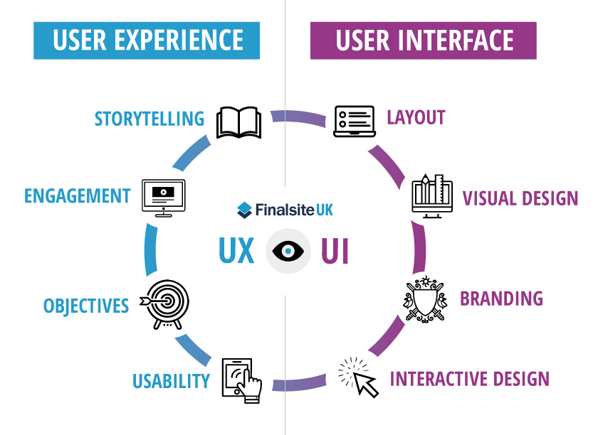
But though they influence one another, UX and UI are different aspects of design. UX determines where your user base wants to accomplish and UI helps them accomplish it.
UI designers combine graphics, interactions, and branding to produce the best possible layouts. UX designers determine what exactly that layout should be according to what their customers most enjoy. UI is the actual elements and appearance within a site, and UX is the overall experience of using it.
UX
Is the site easy to use and understand, or is it frustrating? User experience is the overall experience a user has with a company’s products or services. Good or bad user experience design is determined by how easy or difficult it is to interact with each aspect of a product or service. Best practices in UX improve user interactions and therefore the perceptions of those products and services.
UI
User interface is the graphical layout of an application or website. Any visual element (buttons, headings, links), interactions (scrolling, clicking, leaving the page), or animation videos (pop-ups, videos, reactions) that’s designed is part of the user interface. UI designers focus on creating a layout customers love and entice them to take the actions designed by their UX counterparts. Their job is to turn a conceptual content and layout into an attractive, intuitive, and responsive interface for users.
Why does UX matter for SEO?
SEO is impacted by how navigable, responsive, and easy-to-use your site is. You could have the best information from the most authoritative expert in the world, but if people don’t like using your site or viewing your content, it will be very tough to rank well.
To determine the user experience of your site, Google measures how users interact with a page and even test it themselves using something called “RankBrain.”
Introduced in 2015, RankBrain is a part of Google’s core algorithm that uses machine learning to replicate a visitor’s experience with a page. It uses signals like pages per session, bounce rate, dwell time, and organic CTR to rank the page based on the quality of that experience. The higher the quality, the better it’s going to be for your Google rankings.
Some questions important question you could about your site to review its UX and how it can impact SEO:
- Why are my customers not clicking this button?
- How do I get them to keep scrolling to the bottom of the page?
- Have I included enough information to answer my users’ questions?
- At what point on this page should I add this new feature?
- Why are they hovering over this content section without clicking the CTA?
- What is my site loading speed?
- Is each page enjoyable to use, even (or especially!) for someone who has never used it before?
- How can I get to the purchasing page from my blog article?
Once you’ve answered these questions (and others) and made a clear plan of action for improvement, you can go to your next step: updating the user interface.
Why does UI matter for SEO?
Websites that are easy on the eyes and easy to navigate tend to keep users on page longer than ones that do not. Your UI should be clean and functional in order to maximize your website’s SEO value. Stick to a simple, clean web design with a clear page hierarchy; it shouldn’t be confusing to get from one page to the next. Sometimes people refer to the 3-click rule — it should take no more than three clicks to complete any action on your website.
It’s also important to evaluate the backend of your site, which includes page sizing, load speed, responsive designs, and playable videos. If you’re a WordPress user, there are a million and one plugins you can use to optimize your site. Look into plugins like:
- Lazy Load to speed up image load times
- WP Rocket for site speed
- Easy Table of Contents to make your blog posts more skimmable
- Yoast to redirect old pages
- And a ton more! Check out the WordPress plugin directory.
How Do I Improve UI & UX for SEO?
There’s a reason UX and UI get confused when marketers are working on SEO. That’s because they influence one another so much, as well as a lot of the same elements.
The main goal of UI and UX is to keep users on individual pages longer, on your entire site longer, and interacting with your elements. To do this, you should focus on a few things to keep your SEO positively impacted by UX and UI.
1. Website Speed
Would you rather use a slow website with an outdated theme or a lightning-fast site with a great user interface (UI)?
Site speed is an important part of any good web experience. In fact, the number of people who leave your site will increase dramatically the slower your webpage loads.
If your site takes longer than 5 seconds to load, you can lose 40% of your traffic. Site speed is an important part of any good web experience, and the right UI design elements can help keep it quick.

As such, you should ensure your site is reasonably fast. If you’re just starting out, you shouldn’t have to concern yourself too much with site speed.
However, if you are noticing a slowdown, you can take a few steps to increase your speed:
- Check your website speed here or right on Google
- Compress all of your images using a simple image compressor like ImageOptim.
- Install a lazy load plugin, which will make it so that images and other rich content on your site will only load when a user scrolls down the page. Therefore, your webpage will not have to load everything all in the beginning of a user’s session.
- Use a CDN. CDNs, or content delivery networks like Cloudflare allow you to load your content dynamically via other servers. This reduces the weight on your server and should theoretically make everything load faster
2. Ease of Use
Another simple—but important—concept is making your website or app easy to use. It should be clear what actions can be taken on each page, how to complete what task they came there to complete, and easy to do it. For example, lots of links close together are a no-no because they make it a lot more difficult to click the one you want.
Though it may be tempting to add a lot of fun graphics or animations, UX designers know it can be frustrating to have too much going on that can prevent users from accomplishing their goals.
Remember the “3 click design” rule? While this rule certainly isn’t hard and fast, in general a user should be able to get from one page to any other page on a website by clicking no more than three times. This means your website hierarchy and navigation should be intuitive and easy.
Stick to a simple, clean web design. Use a template! WordPress, Wix, Shopify, and nearly every other site builder have templates that make it easy for you to plug and play. Don’t try and create your own template from scratch. It’s a waste of money and likely will not be as clean and simple as out-of-the-box designs.
3. Accessibility
Accessibility is a huge part of web design in the UX and UI realms. The WCAG (Web Content Accessibility Guideline) is an internationally recognized set of guidelines for digital accessibility that are managed by the W3C, the international web standards group.
For example, people with visual impairments might find it tough to view and use this button with the purple on purple:
While this button on the white background is easier to see:
Website accessibility has been broken down into four basic principles:
- Perceivable: Users must be able to perceive the information being presented. It must be visible to at least one of their senses, such as by adding captions and other alternatives for multimedia
- Operable: The interface cannot require interaction that a user cannot perform. This is important for everyone! This might include making all functionality available from a keyboard, or not using flashing, bright animations that can affect those that are seizure prone.
- Understandable: Users must be able to understand the information as well as the operation of the user interface, which is a basic making text legible and understandable.
- Robust: Users must be able to access the content as technologies advance, such as assistive technologies.
UX & UI designers take all of these needs into consideration to create user experiences that are effective for every user, making the web a better experience for everyone.
4. Mobile Readiness

Have you ever clicked on a site from your phone and half the page is off the screen, the buttons are too small to click, or you can’t find the nav bar? It’s frustrating right? This is why it’s so important to have a website design that’s optimized for mobile usage.
The majority of users access Google from a mobile device. As a result, Google now uses mobile-first indexing when indexing and ranking a page. This means it’s essential to check your site loads correctly on mobile and is easy for mobile users to read and navigate.
Even if your site looks and loads perfectly on a desktop, your rankings will suffer if you can’t say the same about the mobile version. A mobile responsive theme is a must. As is checking that the text appears large enough on small screens, navigation buttons are easy to press, and so on.
Google recommends responsive design—a grid-like design that dynamically adjusts to all screen sizes including desktops, tablets, and smartphones. You can check for free with Google’s free mobile-friendly checking tool.
5. Readable Content
Content is a huge part of SEO, and making it readable and engaging makes it easier for searchers to get what they came for while enjoying their time on your site.
You can do this by:
- Using conversational wording
- Varying sentence lengths
- Include plenty of spacing
- Use headers (h1s, h2s, h3s, etc.)
- Take advantage of bullets, numbered lists, and tables (like this bulleted list!)
- Include rich images, infographics, and even video
You will curry favor with Google if your content keeps users on the page longer. So the more engaging, enjoyable, and helpful your content, the better.
Note: GrowthBar’s Content Generator gives you on-page SEO and readability optimizations all while you write with AI.
Conclusion: UX, UI, and SEO Working Together
UX, UI, and SEO all have a common goal: to help individuals complete the tasks they set out to complete.
Because of this goal, UX and UI greatly will impact a website’s SEO and Google rankings and should be a big part of your SEO efforts, whether those are on your own, while using a marketing tool, or working with an SEO agency.
You should always be looking for ways to improve user experience. If you think a simple design element makes something easier to read or will keep users on page longer, it probably will. If you find it hard to get to a page on your site, you can guarantee potential customers find it harder.
Luckily, the merging of web development and UX and UI design has led to a great expansion of no-code tools, meaning that you can now create and design software without necessarily needing coding skills.
This gives businesses and modern marketers the opportunity to improve their UX and UI for SEO, creating sites their customers will love using.


